Spotify's Disco Ball Icon Overshadowed 20-Year Milestone Campaign
Spotify's 20th anniversary disco ball icon flooded social with 300% spike in mentions, yet 56% was neutral noise. How a visual distraction buried the intimate 'Party of the Year(s)' feature.

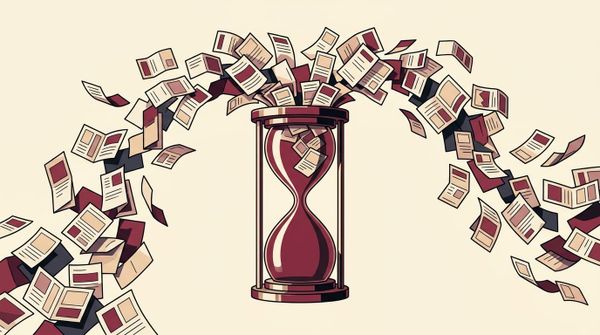
Spotify turned 20 in May 2026 with what should have been a slam-dunk campaign. The company launched a deeply personal, data-rich feature called "Party of the Year(s)" that let users revisit their entire listening history. First song ever played. First day on the platform. All-time favorite artist. It was nostalgic, intimate, and available in 144 markets across 16 languages.
Then someone swapped the app icon for a disco ball.
Within days, the icon was the story. The feature that took months to build? Buried.
The number that tells the whole tale
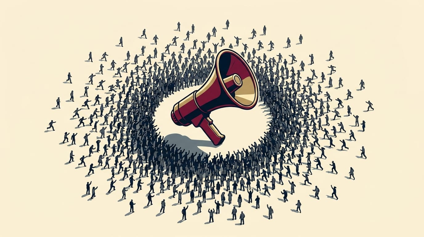
Media intelligence firm CARMA tracked the response and found that social mentions spiked more than 300% above Spotify's average daily volume. But here's the detail that should concern any marketing leader: 56% of that conversation was neutral. Not celebratory, not emotional, not connected to anyone's personal listening story. Just noise about a logo.
CARMA put it plainly: "The visual itself drove more engagement than Spotify's official anniversary messaging."
The negative 18% were mostly frustrated users who described the disco ball as looking like a loading screen or a broken app indicator. They weren't upset about the design. They were upset because something they rely on every single day looked wrong. That's a different kind of complaint, and a harder one to manage.
Looking for World-Class PR & Comms in APAC?
Tailored service packages for select brands and agencies.
Why app icons are uniquely high-stakes
Most campaign elements compete for attention in a crowded feed. App icons are different. They sit on a user's home screen, seen dozens of times a day without any conscious effort. Changing one isn't a marketing move. It's an interruption.
Truescope, another media intelligence firm, noted that sentiment started mildly positive when the icon first appeared but turned negative once more users encountered it on their home screens. The backlash escalated fast enough that Spotify confirmed the disco ball was always meant to be temporary, but only after the controversy had already taken hold. That timing matters. Proactive messaging ("this is a four-day special icon") would have reframed the entire conversation.
Stanley Clement, CEO of MBCS, was direct in his assessment: "Beyond the change of the app skin upon update, there was little visibility or hype, neither did it lead to anywhere special that indicated this 20th anniversary campaign."
The split in the industry
Not everyone agreed the icon was a mistake. Kelly Phua, associate director of strategy at VaynerMedia APAC, argued the disco ball was part of a wider experiential campaign including holographic streamers and bold aesthetics. "It is a surprise drop, grabs attention, and it gets people talking whether good or bad," she said.
Junxian Zhang, founder of BDSA Marketing, made an interesting point about attention: "Our minds are wired to filter out the familiar. The moment something shifts, it interrupts that autopilot." He acknowledged the icon succeeded in breaking through, but missed the emotional depth. The real opportunity, he said, was showing users how their music taste changed over 20 years and connecting that to personal growth. Instead, the icon sparked a debate about minimalism in tech design.
What this means for campaign planning
The Spotify case is not really about a logo. It's about execution elements that live outside the campaign brief but inside the user's daily life. App icons, push notification sounds, default ringtones, browser extension badges: these are all high-frequency touchpoints that carry brand meaning users have built up over years. Changing them mid-campaign introduces a variable most campaign plans don't account for.
The data-rich "Party of the Year(s)" feature was strong enough to carry the anniversary on its own. A four-day disco ball icon turned a would-be Wrapped-style moment into a crisis management exercise.
Want to reach thousands of marketing and comms professionals across Asia?
Get your brand in front of industry decision-makers.
Partner with Mission Media →